YMCA Mid & South Canterbury
Website Design
The Brief
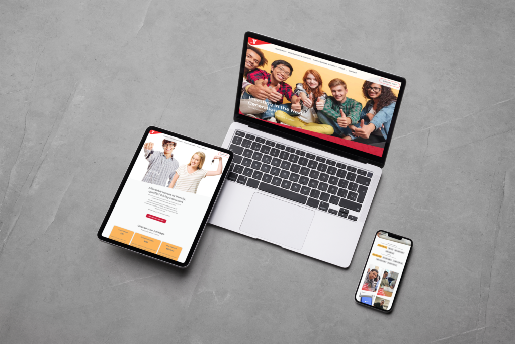
YMCA Mid & South Canterbury provide critical youth development programmes and services across the region. They approached us to update their existing website. The old design was functional but needed a modern refresh to keep in line with updated branding guidelines. The Y also wanted to add new elements and information about their current programmes and serviecs. Of course we were happy to oblige!

The Design
The website design drew heavily from the Y’s updated branding guidelines. Branding guidelines provide a cohesive and definitive document that lays out the visual elements of a brand such as colours used, fonts and favourite ‘how not to use the logo’. For more – see our blog post What Are Brand Guidelines And Why You Should Be Sticking To Them.
Colours
The dominant colours used through the website are white, black, and red. These are strong colours that help people recognise a brand instantly. They also bring to mind Tino Rangatiratanga, the national Maori flag. The weaving background is representative of South and Mid Canterbury: the Y is based in both places but they are woven together and stronger when acting in unity. In addition, yellow and purple are used as accent colours for a lively, youthful feel.
It was a deliberate decision to have a separate section to acknowledge key funders. The support of these organisations is critical to the ongoing work of the Y, and it was only right to show this. In the interests of fairness, funders are presented in alphabetical order, with their logo linking through to their own websites.
Locations & Filters
The Y has bases in four different locations – Christchurch, Ashburton, Timaru and Oamaru. We displayed these through the use of Location tabs under the menu bar. Each tab showcases the specific programmes and courses offered at that location, such as Drive To Work or Raise Up, along with contact information and a Map.
Filtering by location is also used on the Programmes & Services page. Button elements let the user filter by a variety of options: Single Location, All Locations, Single Service Category, or All Service Categories. Once a course is selected, a CTA or Call To Action button links through to an online enquiry form. This reduces the friction of user experience and increases submitted enquiry numbers.
Reducing User Friction
Another section where we reduced user friction was on the Y-Drive page. It had the potential to be very visually busy, as it had to convey a lot of information: locations, different driving packages, costs, testimonials, and a detailed booking form!
We kept this streamlined with the use of visual separation between sections. Rather than making the booking form a new step in the process, we incorporated it right into the page. Users can simply select their options, input their information right on the page, and then hit “submit.” This streamlines the process and removes mental and physical barriers to entry.


A Unique Design Element
One unique aspect of this design that we love is the angled element carried through from the logo to the rest of the website. The element creates visual interest as it is both an angle and a curve, and forms a pleasing contrast to the linearity of the rest of website. To lend consistency, the repeated shape is not only used in main areas but also in sub-pages, creating a coherency that ties the website together and is pleasing to the eye.
In larger areas the angled element creates a linear separation of spaces, such as in page headers and footers. This helps the user focus on what is important on each page and find the information they need. Smaller areas also use the element, for example the individual Programmes & Skills tiles. An overlapping angled graphic in red is also incorporated for contrast and visual interest. These are used throughout the website as defined in the branding guidelines.
We’ve loved working on this website redesign for the Y and are sure it will be a great asset for them for years to come.

Do you want to work with us?
We try to do things a little differently. Instead of just asking for your requirements, we work with you to create something that’s going to have an impact on your business.


