24/7 Construction
Website Design, Logo Design
The 24/7 Brief
As a brand-new startup company, 24/7 Construction came to us for a logo design and complete website build. This can be really fun from a design perspective as we help develop a company’s branding to fit their business vision and values — from a blank slate & without any preconceived ideas. For more about this, check out our blog Your Brand, Your Story, Your Business: Why You Do What It Is That You Do.
The 24/7 Logo
For the logo we wanted something solid and impactful to convey values of strength and durability. We chose a blocky stencil-style font as, this has an immediate association with the construction industry. Black and yellow are also classic construction colours. As a bonus, the yellow adds a modern contrast to an otherwise neutral palette of black, grey, and white.
Good building work is all about clean lines and accurate angles, along with a good dose of creativity of course! We used the repeated angles in the numerals to create a layered element with almost an origami effect. This created visual interest and depth, and allowed for different colours and saturations in the ‘folds’ of the logo.

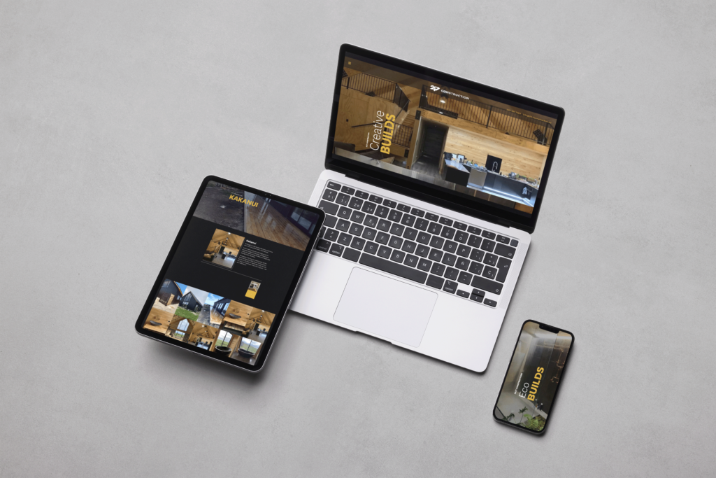
The 24/7 Website
Continuing to experiment with angles and lines, we laid text headings out at a 90-degree angle from the standard horizontal plane. With any design, a novel component must be used carefully. If it is used too heavily it will feel overdone, which then overwhelms and confuses the website visitor. The sideways text is only used in headings on the home page, thus keeping it focused and contained. It is easily read by website visitors while adding an element of originality and lateral thinking that is essential to any problem-solving industry.
The images that make up the scrolling background of the home page serve a dual purpose:
- For the first, they make a fantastic showcase of the company’s work in areas ranging from historic renovations to modern eco-builds and more.
- Second, they form a series of transition zones between different sections of the site. The line between images makes a natural boundary to the eye, signalling clearly that one subject has ended and the next has begun — for example the shift from Earthworks, with its digger and trench, to Emergency Repairs, with its spiderlike cracked glass.
To create cohesion with the main page and to aid in navigation, we added a grid section to the bottom of each services page. The grid displays images of the main services 24-7 provides. When moused over, a card in contrasting yellow slides up with a short text description of the service. These cards also link through to the corresponding service pages as an alternative to navigating via the menu.
We were thrilled to help develop 24/7’s branding in line with their vision for the business, and are sure their new logo and website will be great assets to help them on their way to success.
Do you want to work with us?
We try to do things a little differently. Instead of just asking for your requirements, we work with you to create something that’s going to have an impact on your business.


